Formatting Your Print Book and eBook: 6 Best Hacks
“Have nothing in your houses that you do not know to be useful or believe to be beautiful.” — William Morris
Formatting is one of the moments when a manuscript finally begins to look like a book. That change is exciting, but appearance alone cannot tell you whether the files are ready.
For formatting books, I have use Microsoft Word and Scrivener’s Compile feature for one book. Now, I do most of my formatting in Atticus. Each method can produce a usable book when you understand its strengths and inspect the results.
The first decision is bigger than fonts and chapter headings.
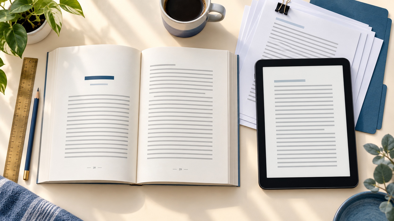
You are creating two different reading experiences: a fixed print interior and a reflowable eBook. Your print-ready PDF controls physical pages. Your EPUB needs to adapt when readers change their screen, font, text size, spacing, or orientation. Those different jobs require separate production decisions and separate checks.
This writer’s guide covers the files you produce and inspect on your own computer. Amazon KDP’s upload process, online previewers, print proof, and final technical approval will be covered in another writer’s guide in this series on publishing your book.
If the manuscript still needs substantial cleanup or missing book material, return to the writer’s guide, “Prepare Your Manuscript for Publishing,” before you begin. Formatting works best when you already control the content and source file.
Your Print PDF and EPUB Have Different Jobs
A print-ready PDF preserves the size and position of the elements on every page. The trim size, margins, running heads, page numbers, chapter openings, and image placement stay where you put them.
A reflowable EPUB works differently. The text and other elements adjust to the space available in the reader’s device or app. The EPUB 3.3 specification describes reflow as the default behavior for EPUB publications.
That flexibility is one of the eBook’s advantages.
A reader may enlarge the type, select another font, increase line spacing, or switch from a phone to a tablet. Each change can alter how many words fit on a screen.
Here is the practical difference:
| Formatting decision | Print-ready PDF | Reflowable EPUB |
| Page size | Uses a fixed trim size | Adapts to the reading screen |
| Margins | Set as part of the physical page | May change with the reader’s settings |
| Headers and footers | Can carry running heads and page numbers | Usually omitted because screens and locations change |
| Chapter openings | Begin in a controlled page position | Begin as a structured section in the reading flow |
| Table of contents | May use printed page numbers | Uses links to the book’s sections |
| Images | Stay in planned page positions | Must resize and move sensibly with the surrounding content |
| Inspection | Requires a page-by-page review | Requires reflow, navigation, link, and image checks |
This means you shouldn’t judge the EPUB by how closely it copies the printed pages. Judge it by whether readers can move through the book easily and read it under different settings.
Make Your Print Decisions as a System
Print settings affect one another. A change in trim size or body font can change the page count, which can affect the margins, table of contents, spine width, and later cover dimensions.
I keep my recent books simple by using a 6 × 9-inch trim size. KDP currently describes 6 × 9 inches as the most common paperback trim size in the United States, although it supports several alternatives.
Your genre, word count, images, and desired reading experience may point to another size. Check KDP’s current trim size, bleed, and margin guidance before you finalize the interior.
Set the trim size first
Trim size is the finished width and height of the printed book. It determines the physical space available for the text and establishes the starting point for the remaining page settings. Choose the trim size before adjusting the details. If you change it late, inspect the entire book again because headings, images, blank pages, and chapter openings may move.
Decide whether the interior needs bleed
Bleed applies when an image, background, or design element extends to the trimmed edge. Most text-heavy novels and general nonfiction interiors can use a no-bleed layout.
If the interior does use bleed, the artwork must extend beyond the final trim line. KDP currently specifies an extension of 0.125 inch beyond the top, bottom, and outside edges and requires a PDF for a bleed interior. Treat those measurements as current output targets and verify them before publication.
Set margins for the finished book
The inside margin, often called the gutter, keeps text from disappearing into the binding. The outside, top, and bottom margins give the page breathing room and protect the content from trimming.
KDP’s minimum margin guidance changes with page count and bleed. Use the current table for the book you are producing rather than carrying numbers forward from an older project.
When I first started using Atticus, I frequently had headings alone at the bottom of a page and single bullet points at the top of the next page. After I corrected the margins in Word before importing the manuscript, I encountered fewer of these problems. That was my experience with my files.
It is important to inspect the Atticus layout after import because the same Word setup may behave differently with another manuscript.
Choose fonts you can use and embed
Typography should make the book comfortable to read. Choose a clear body font, create a visible hierarchy for headings, and use decorative type with restraint. Also check the font license. A font available on your computer may have limits on commercial use or embedding. Keep the license information with your other production records.
KDP’s current paperback submission guidelines tell authors to embed fonts in interior files. After export, check the PDF’s font properties and confirm that the required fonts are embedded rather than substituted.
Atticus says the body fonts supplied in its print settings are free for commercial use. If you add or use fonts from another source, verify that source’s current license yourself.
Plan headers, footers, and page numbers
Decide what your running heads will show and where the page numbers will appear. Check whether chapter-opening pages, title pages, blank pages, and other special pages should display them.
Print page numbers must remain in sequence even when a number is intentionally hidden. For a left-to-right book, odd-numbered pages belong on the right, and even-numbered pages belong on the left.
Front matter sometimes uses Roman numerals while the main text begins with Arabic page 1.
Your software may automate that arrangement, but you still need to inspect the result.
Make chapter openings consistent
A chapter opening can include a number, title, subtitle, ornament, image, or extra space above the text. Choose a pattern that suits the book and apply it consistently.
Also decide how the first paragraph begins.
Many print books omit the first-line indent after a chapter heading or scene break. Whatever you choose, check for exceptions created during import or export.
Check the print table of contents and images
A print table of contents may point readers to fixed page numbers. Generate or update it after the layout settles, then check the entries against the final PDF.
KDP currently asks for manuscript images with a minimum resolution of 300 DPI. Inspect them at their final size and look for blur, separated captions, unexpected cropping, or small text that may be difficult to read.
Build the eBook for Reflow and Navigation
An eBook has no dependable top, bottom, left page, or right page. Its structure tells the reading system where sections begin and how readers can move through them.
KDP currently accepts EPUB, DOCX, and KPF files for reflowable eBooks. I use EPUB as the production target here because Atticus exports it directly and the file can be inspected before upload.
Start with consistent chapter titles and heading levels.
A paragraph that merely looks like a heading may not function as one in the EPUB’s structure or navigation.
Atticus currently generates a linked EPUB table of contents from the project’s chapter titles. Its documentation advises using relevant, unique titles for every chapter so the entries are clear and distinct.
Open the completed table of contents and test every entry. A list of chapter names can look correct while one link opens the wrong section.
Links inside the book also need attention. Use descriptive linked words that tell the reader where the link leads. Test external links and any internal links included in the exported EPUB.
Atticus currently recommends adding hyperlinks inside Atticus because links imported from Word may not transfer reliably. Whatever program you use, test the links in the exported EPUB rather than assuming the handoff preserved them.
If an image adds meaning, give it concise alt text that communicates its purpose.
Handle decorative images so assistive technology doesn’t interrupt the reader with an unhelpful filename or description.
Accessibility also includes logical heading order, readable contrast, useful link wording, and text that remains usable when enlarged. The current W3C EPUB Accessibility specification provides the formal standard.
Automated tools can find some accessibility problems. Ace by DAISY is a free EPUB accessibility checker, although passing an automated check does not replace human review.
Fonts also behave differently in an eBook. Some readers select their own typeface, size, and spacing. A restrained design is more likely to remain readable when those preferences override part of your formatting.
Pay special attention to:
• Chapter and section order
• Scene-break symbols and spacing
• Lists and block quotations
• Images, captions, and alt text
• Footnotes or endnotes
• Internal and external links
• References that depend on print page numbers
If your book depends on fixed image placement, writing spaces, facing pages, or intricate tables, a reflowable EPUB may require significant redesign. Picture books, workbooks, cookbooks, and heavily illustrated books often need specialized decisions beyond this article’s main path.
Choose a Formatting Method That Fits the Book
I have used Atticus, Word, and Scrivener for book production. My experience with Atticus is the most recent and extensive, while my Scrivener experience comes from compiling one book.
Each method gives you a different balance of setup, control, and convenience.
The useful question is whether the method can produce the editions you need and whether you can inspect and correct its output.
Our writer’s guide, “Atticus vs. Dabble: Choose Your Workflow,” can help if you still need to decide where the manuscript will live before it reaches this production stage.
Atticus
Atticus is my current formatting program. I import my manuscript, choose one of its templates, and edit the theme to include my preferred text and heading fonts, page numbering, and chapter openings.
I can reuse that theme with later books, which saves time and keeps my recent interiors consistent.
I still inspect each book because its chapter lengths, lists, and other content create a different page flow.
Atticus provides separate print and digital previews and currently exports a PDF for print and an EPUB for eBooks. Its formatting guidance covers trim size, margins, fonts, headers, footers, pagination, and EPUB navigation.
The program has occasionally created frustrating page-level problems for me.
In one book, the Action Steps or Checklist heading appeared at the bottom of the last chapter page while the actual list became a new chapter by itself.
I cut and pasted the list beneath the correct heading. After I corrected the layout, the PDF and EPUB were fine. I now include introductory text below the final heading and a natural closing paragraph after the last step or checklist item.
Microsoft Word
Before I purchased Atticus, I formatted books in Word. It gives you detailed control through styles, custom page sizes, margins, section breaks, headers, footers, and page numbering. That control involves more manual setup.
Section breaks deserve special attention because one incorrect break can change the pagination, headers, or margins in the pages that follow.
Microsoft Word supports direct PDF export. Its current supported-format reference lists PDF and DOCX, while EPUB is absent from the Word formats.
If you choose Word and want a locally inspectable EPUB, plan another production step.
You might move the DOCX into dedicated formatting software, use a suitable conversion workflow, or hire someone to create the EPUB.
Scrivener
I used Scrivener’s Compile feature for one book. Compile gathers the manuscript’s folders and documents, applies the selected section layouts, and creates the chosen output file. Scrivener offers considerable control, although its Compile settings can take time to understand.
Literature & Latte’s current documentation covers compiling for print, PDF, or DOCX and compiling an EPUB eBook. It also emphasizes checking the compiled file and revising the project when the output needs correction.
Professional formatting
I have not hired a professional formatter because the cost has been too high for my budget. That does not make professional help a poor choice for every author.
A formatter may be sensible when the book has complex tables, extensive images, unusual scripts, formal accessibility requirements, or a fixed layout. Professional help may also be worthwhile when learning the software would place too much pressure on your schedule.
Before hiring someone, ask which source files they accept and which finished files they provide. Clarify font licensing, accessibility work, source-file ownership, revision rounds, correction fees, and the schedule in writing.
Even when someone else formats the book, the author still needs to inspect the deliverables. The formatter cannot decide whether every chapter, image, heading, and link matches your intentions.
Inspect the Files You Actually Exported
My current production process starts by previewing the print book or eBook inside Atticus. I then export the files, upload them to KDP, use its previewer, and order a proof copy for the print edition.
The KDP checks and physical proof are later safeguards, which Article #6 will cover. A stronger local quality-control plan also opens and inspects the exported PDF and EPUB before the files reach KDP.
This matters because the exported files are the deliverables. A clean view inside the formatting program does not guarantee that every font, link, page break, or navigation entry survived the export.
Inspect the print-ready PDF
Open the PDF in a dedicated PDF reader. Confirm the page dimensions first, then review the pages in sequence and in a two-page view when your reader provides one.
Check the PDF for the following:
• The trim size and page dimensions are correct.
• The margins and gutter provide enough space.
• Bleed elements extend correctly where the book uses bleed.
• The pages appear in the intended order.
• Blank pages are intentional.
• Odd and even pages fall on the correct sides.
• Headers, footers, and page numbers follow the chosen rules.
• Chapter openings use the same design.
• Headings stay with enough of the following content.
• Lists do not leave distracting isolated items.
• Images, captions, rules, and ornaments remain clear.
• The print table of contents uses the final page numbers.
• Fonts are embedded and have not been substituted.
• Comments, placeholders, crop marks, or watermarks are absent.
Examine the whole PDF after each export. A small correction can move material several pages later in the book, including pages that looked fine during the previous inspection.
Inspect the EPUB
Open the exported EPUB in an independent reader or inspection tool. Test it at several font sizes and, when available, across multiple screen widths or orientations.
Check the EPUB for the following:
• The book opens without an error.
• The chapters and sections appear in the correct order.
• Every navigation-table entry opens the correct section.
• Headings have the intended hierarchy.
• Text reflows without overlapping or disappearing.
• Scene breaks remain visible and consistent.
• Lists and quotations retain their meaning.
• Images resize sensibly and include appropriate alt text.
• Internal and external links work.
• Footnotes or endnotes move readers to the correct content.
• Font and spacing changes leave the book readable.
• No instruction depends unnecessarily on a print page number.
Technical validation is another useful check. A validator can identify structural errors inside the EPUB that may remain invisible during ordinary reading. Accessibility checking asks additional questions, so keep those two results separate.
Keep Corrections and Versions Straight
Formatting often reveals a missing word, repeated heading, broken link, or layout problem. Decide where the correction belongs before you change anything.
The maintained source should control future exports. If you patch only one PDF or EPUB, the same problem may return the next time you generate the book.
I also keep a correction log when a change may affect more than one edition. After correcting the source, I re-export every affected file and repeat the relevant inspection.
Use filenames that tell you what the file contains. A simple pattern can include the title, edition, format, trim or bleed choice when relevant, and version number:
• BookTitle_Print_6x9_NoBleed_v03.pdf
• BookTitle_eBook_v03.epub
• BookTitle_FormattingCorrections_v03.docx
Some books also need separate project editions. I am more likely to maintain a separate edition for a workbook because its print layout and reader activities may differ substantially from the eBook.
The exact naming system matters less than using it consistently. Keep source files, exported files, and later uploaded files in clearly identified locations so you can trace every correction.
Formatting Action Steps
Use these steps to create and inspect the two interiors before moving to the next publishing stage.
1. Choose the print trim size and decide whether the interior needs bleed.
2. Set the print margins, typography, chapter openings, headers, footers, page numbering, images, and table of contents.
3. Build the eBook around consistent headings, reflow, navigation, links, flexible images, and accessibility basics.
4. Confirm that your formatting method can produce a print-ready PDF and a locally inspectable EPUB.
5. Preview the print and eBook versions inside your formatting program.
6. Export the PDF and EPUB with clear filenames and version numbers.
7. Open and inspect the PDF page by page.
8. Open the EPUB independently and test its reflow, navigation, links, images, and structure.
9. Correct the maintained source, update the correction log, and export every affected file again.
Once both interiors pass their local checks, keep them with your controlled production files. You will need the final print page count for the full print cover, and the next article will help you develop the separate covers for your eBook and print edition.
For more guidance, see other writer’s guides in this series. We suggest starting with the first one, Prepare Your Manuscript for Publishing.
We hope you found these writer’s guide strategies helpful and inspiring. They’re intended to provide you with the necessary tools and insights to succeed as an indie author.
You might also enjoy some of our books:
AI Future Ready Skills for Indie Authors
Amazon KDP Made Easy: A Simple, Stress-Free System to Self-Publish Your First Book on Amazon
Writing is an ongoing adventure that involves continuous learning and improvement. You don’t have to go through this alone. We are excited to accompany you every step of the way, providing you with support and motivation. Our goal is to give you the knowledge and practical advice to navigate the world of writing with confidence.
Don’t wait. Start today! How can we help? To let us know, please fill out our Contact form.
Happy writing!